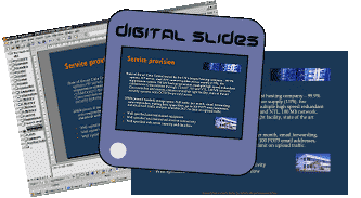
Slides from PowerPoint

We have found that PowerPoint is a reliable application in terms of ‘what you saw on screen is what you get on film’. It is also a very versatile, simple to use and yet can be very complex if you want to spend the time learning it’s capabilities. However, we accept files generated by most popular PC and Mac programs. Even where we don’t directly, most programs can save or export in generic format such as EPS, TIFF or PDF. Incidentally, we are finding great success with the PDF format as it solves many of the problems of transferring files from one computer operating system to another.
There are some points to bear in mind though, before you embark on your project.
Page size

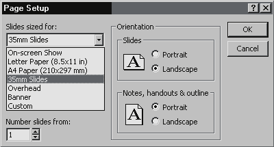
35mm slides have a 3:2 proportion. By default PowerPoint sets a page size of ‘On-screen’. This setting will give you black bars on the left and right of the frame instead of filling the slide. In PowerPoint select File: Page setup: 35mm slides. In other programs look for similar settings or set a page size with 3:2 proportions – 7.33″x11″ or 18x27cm will give correct proportions and fit on your A4 inkjet printouts.
It is important to set up your page size before starting work. In PowerPoint if you change the page size with an existing project it will ‘helpfully’ stretch and rearrange text and images to fit the new page size – do check very carefully that the effect is acceptable to you – it might be better to start again in 35mm format.
Working area
The page you design will be the exact area that records on film. Make sure your background colour fills the entire page area or you will get unwanted black or white edges. Keep text and graphics away from the page sides unless you deliberately want to ‘bleed’ an image – 2cm margin is fine.
Fonts We support Truetype, OpenType and Type 1 fonts. However, if you are using any fonts other than those that come with Microsoft Office, PowerPoint, CorelDRAW or Adobe Illustrator then please include then on disk (or convert them to outlines, if you know how). Fonts can be problematic – if you are all doubtful stick to Ariel, Helvetica, Times or Courier.
PDF files have the option of embedding fonts, which is a wonderful thing.
Colour accuracy
Computer screens, desktop scanners and 35mm film work with RGB colours and so must you. PowerPoint runs in RGB mode anyway.
If you are used to working in CMYK for litho print output this can take some getting used to, but is important otherwise default translation from CMYK to RGB will occur that may lead to unexpected colour shifts. Drum scans and legacy files must be converted to RGB – PhotoShop’s default conversion works fine. If you are into colour profiles please remove them or at the least use sRGB. Colours on film can vary from your screen – all monitors are different. If accuracy is vital we suggest you output one or two test slides to familiarise yourself with the translation.
- Colour choices Generally, light colours on dark backgrounds work best. White backgrounds are a definite no-no as all text will be washed out and you will dazzle your audience. Some combinations do not work – red text on blue background looks bright and bold on screen, on film it is very hard to see.
Have a look at the templates supplied with PowerPoint – they all work well on slide and are a safe bet. Don’t forget that you can adapt a template to create your own design so that your presentation looks different from the preceding speakers! - Scans RGB scans should be ideally 150 to 200 dpi at final size – using JPEG at high quality setting if your software allows it, TIFF otherwise. Embed scans and graphics if possible.
- Check smelling Please use a spell checker on completion of your project – also check speaker names and company names/addresses, errors here are really embarrassing!
- Design suggestions Highlight speaker points not the whole speech. Keep in mind ‘Short and Sweet’ and ‘Less is More’. Try to keep to 5 – 7 lines of 18 point text with headlines in 27 – 36 point. Don’t use CAPITAL LETTERS or underline for emphasis – use bold instead. Allow the slide to breathe – don’t try to cram too much in. Use styles to give a consistent look to the presentation. A couple of different fonts should be plenty!